Logos are the foundation of any brand and they set the tone and communicate the values of your business to your customers. If you’re looking to refresh your logo or maybe even create a new one, consider these 7 different types of logos that designers love to use in their designs. Each will inspire you in different ways, so you can pick and choose which suits your brand the best.
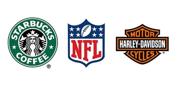
An emblem logo type that features a symbol, imagery or even text inside of a geometric shape. It is a more traditional feel and look to your brand. The can look more "official" or even a little corporate
From logos that contain symbols and images to ones that use only a company’s initials, emblem logos are an effective way to communicate with customers. If you prefer a more traditional or simple logo, consider making your business name one that is memorable in its own right. Just look at Coca-Cola, IKEA and Apple for inspiration.
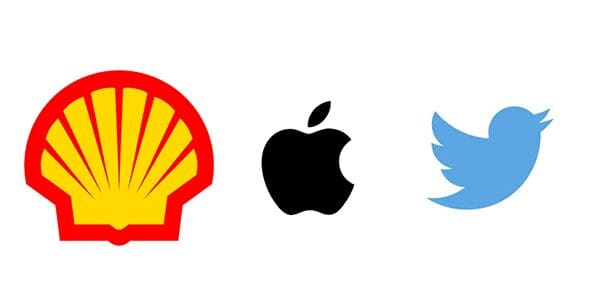
Pictorial marks, or marks that contain an image, represent a symbol and don’t require words to communicate a message. They are a good option for businesses that have limited space on their products and packaging, such as coffee beans or sewing notions. Pictorial marks can also be more memorable than purely worded marks. One drawback to pictorial marks is that they are subject to copyright and trademark laws. A registered mark is protected by law only if it’s used properly in commerce.
However if you are just starting or do not have a solid base and a stable audience, its better to start with some more explicit about what your business does and then adapt a brandmark later. If you look at Apple, they can use a simple logo with anything additional around it because their brand name is iconic and their brand name is also their symbol name. Other brands like Twitter and Facebook can be used without any text as well due to their popularity, but when they started they had their name under the mark.
These are some of my favorite logos because they’re so simple. They often use only one font (or, at most, two), and that simplicity helps make them memorable. For example, Starbucks uses a capital S with a small tas as its logo; Google uses a lowercase g with a slash through it; Canon has just one curvy line and nothing else; and Nike has, well, an N. Simple is better when it comes to logos—to name something is less challenging than having to explain what it is.
The main feature of a logotype is typography and the best choice for that is to have a custom font made. The font's style and color with create an entire identity for your brand. The only drawback to this is that the logotype won't work if your brand has a long name. Also, in time you may have to change the fonts slightly to keep up with design trends.
Designed for print media, such as newspapers and magazines, lettermark logos typically consist of a stylized mark that consists only of letters and is not meant to look like any other graphic. The lettering is often pulled from a logo's name—for example, Verizon's logo features a red V with lines through it—and always takes precedence over its graphical elements. This type of logo works best when in print form and can be created using any number of fonts. Since color isn't an issue, logos can be placed on dark or light backgrounds without losing their legibility.
The only real challenge here is that you have to come up with an eye-catching and unique font since the lettermark logo design uses just a few letters. The biggest drawback to a lettermark logo is that new companies will not be able to use these right away because brand recognization has to be built over the years. Most companies when they are starting out may use the lettermark with their full name under it so people know who they are and then eventually drop the name altogether.
This is a style where you will have multiple lines and it takes up more space. It makes your logo looks bigger, like if you do something with a couple curves it will show off that curve. You can see abstract logos in some food brands, clothing brands or even car companies. An example would be Gatorade or Nike. These logos make their company look bigger because it draws attention to one spot which leaves other spots open for viewing different details about your business that may be located on your logo such as name or contact information. It is a creative type of logo design. Another example would be Starbucks; they always use an abstract logo when advertising new things in their stores or business
For new companies this can be risky as not everyone interprets an abstract logo exactly the same way. The founders of the company might see the logo exactly as it is intended but their target audience might see it entirely different. That being said, the logo will be super unique and if you can overcome the brand awareness challenge then your logo will stand out amongst the crowd.
Nike's iconic swoosh can work alone because the brand is highly popular, but you can still see it represented with the company's name as well. The logo perfectly represents the idea of movement and their slogan "Just Do It" reinforces that idea too. Other great examples are Pepsi and more recently AirBnb, which are sometimes accompanied with their brand names but even without them you will recognize the brand almost instantly.
Airbnb actually transitioned to an abstract logo that brings together its core values.

A logo with a person-like symbol is both intriguing and memorable. Any kid who grew up in New York City in the 1970s can tell you that, thanks to Mr. Met. There are plenty of other mascots out there—even beyond sports teams—that make use of cartoonish figures to represent their companies and brands. These include fast food restaurants (McDonald’s Golden Arches), professional services (accounting firm Deloitte uses its eye), financial institutions (Citibank’s blue C), and even political candidates.
Mascot logos are often used for sports teams, food brands, or even food service companies. If your brand targets children or families, the mascot logo is a great way to go. It will help you establish a fun and family approach.
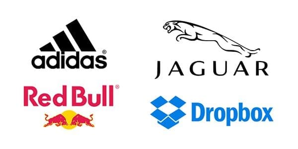
Don’t be afraid to mix and match your logomark and your wordmark. Not every logo requires two separate symbols, but if you feel yours does, make sure to choose a style that compliments both pieces. The right font can define your brand’s personality while working with your mark to express exactly what you want to say. When considering a combination logo, keep in mind that it doesn’t have to be overly complex or designed with two objects in mind.
Placing lettering with symbols, abstract forms, mascots, or even a fusion of any two could work for you business. That's the beauty is that you can create whatever fits your brand the most. You just need to pay attention to the message that you are trying communicate your customers are a part of your brand identity. That great thing about this kind of a logo concept is that once people know about you, it's easier to change your style or be flexible on how you use your logo. In some situations you can use just a wordmark and others you can use just an icon.
When you start brainstorming ideas or looking for inspiration, try and remember what your brand's core values might be and how you will want to present them to your audiences, this is how people will connect to your brand.
We’ve just shown you 7 logo types that will inspire your next design. There are certainly more than 7 types, but these are a great start to expand your creativity and inspiration in creating awesome logos. We encourage you to take a look at each one and let us know which ones really stand out to you! Now it’s time for us all to go back to designing awesome logos!
